


1
2
3
4
Dashboards
We began with a one page dashboard to see how we could communicate overall machine learning performance. Below are some dashboard explorations we tested.
Much of Tamr’s platform is about showing “cleaned-up” data. In this dashboard we wanted to communicate to the user, at a high-level, if their data was in good shape, or if they needed to guide the machine learning algorithm more. We explored a variety of visuals to show if a dataset was in good or in bad health.
Rules Generator
Through conversations with the Field Engineers, we tried to extract information around what would be high-level indicators that the machine learning model was performing well.
We spoke with Field Engineers to ask them for basic understandings around how someone could at a glance know that customer information was accurately grouped. An instance is if First Name, Last Name, and Social Security Number all match, there is a very high likelihood that all rows of data belong to the same person. However, Tamr is not a rules-based system and this would not be technically feasible.
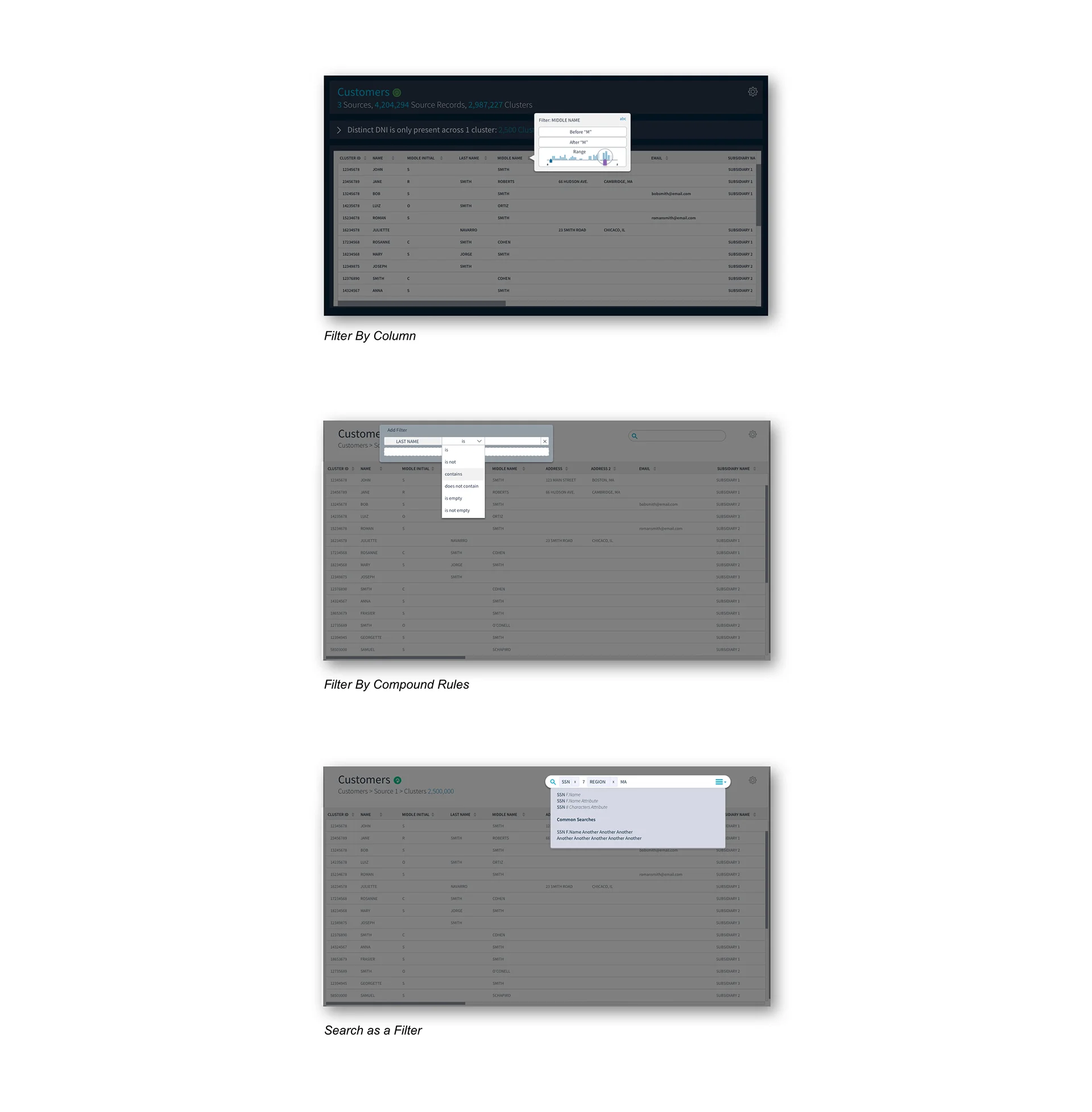
Search and Filter
Through further thinking, we realized these rules were simply "saved filters". We shifted from focusing on rules in a dashboard that act as an alert system (i.e. Not all Social Security Numbers match in this group of rows that have been clustered) and focused on designing and building highly functional search capabilities on the data.
Here we explored possible forms of search formats, from column and row filtering, to a global search.
Clusters and Records
All of these capabilities to highlight information about the clusters (groups of rows e.g. a single customer) and records (rows) within the system. We needed to spend some time around how we wanted to display a cluster vs. a record within this data validation app.
We tried separating them into different pages, having them nested, and creating a heat map. Additionally we tried various visual cues to indicate a record vs. a cluster.