Rating Recipes at HelloFresh
We set out to enable customers to provide us feedback around their early purchase experience so that we can better serve their needs and ensure they get the best recipes possible.
Problem
We want to ensure we’re constantly sending customers the recipes they find most delicious. Every week, we send out an email to customers asking for their impression of the menu they received. Given that a vast majority of our feedback around recipes happens here, we decided to see if a redesign of the experience could increase user engagement. What’s great about this project is that internally, our culinary teams look at which recipes were the most loved and they work on improving them (from the ingredients, to cooking instructions, to portion sizes) so that next time they are on the menu, customers are even happier with these meals.
The interface for customers to give us feedback about the recipes was a bit outdated and the information architecture was not optimized for a pleasant experience. In addition, one thing we noticed was that the recipe survey (the place where we received a large portion of recipe feedback) was only available to the user through a link in the email. We wanted to see if making it more easily accessible was part of the problem.
Hypothesis — If we make it really easy for customers to rate recipes, the response rate will increase.
Duh! But really, we were starting from square one here.
Solution
We introduced a banner that sits in the weekly menu area, which guided customers to rate their recipes. They were directed to a carousel containing their previous week’s menu.
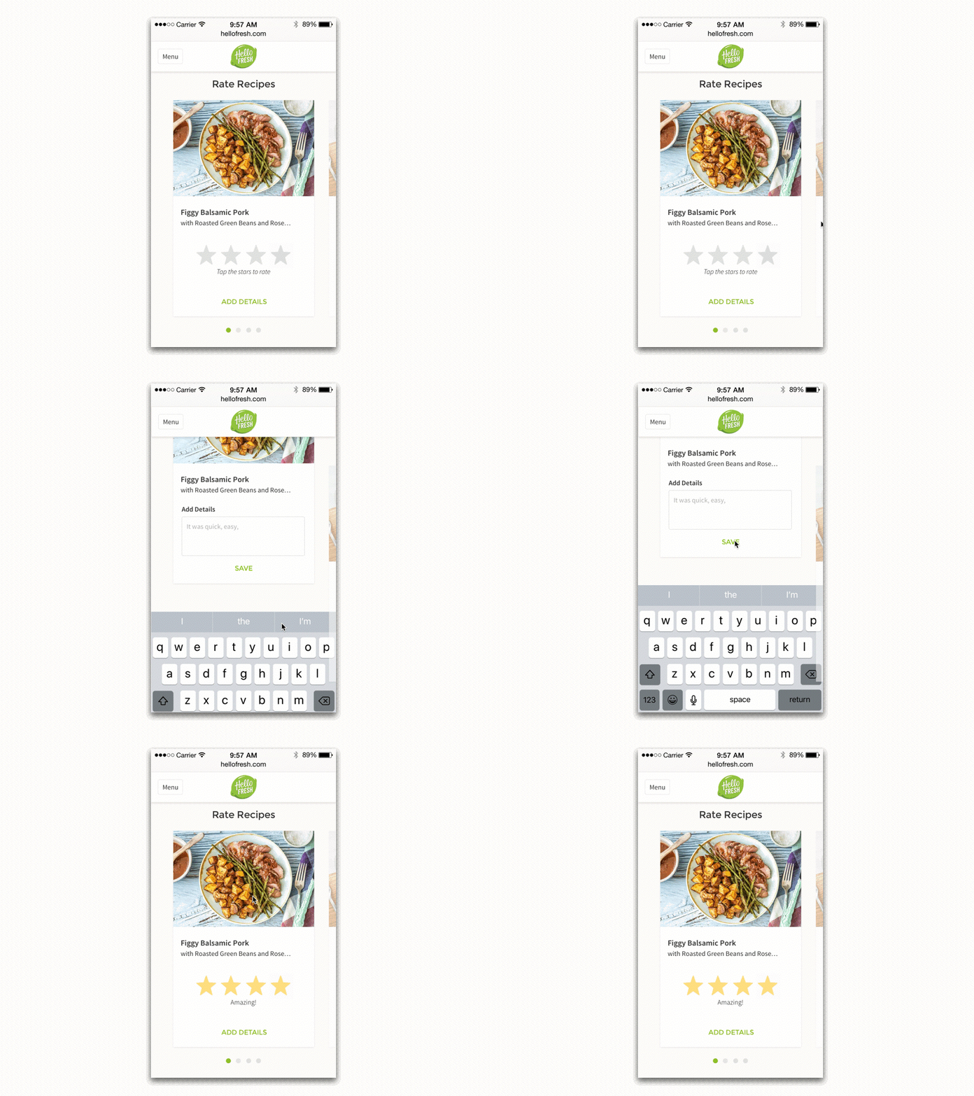
We employed the use of progressive disclosure to minimize cognitive load inside the experience, while still obtaining meaningful feedback from customers. As a bonus, we introduced the idea that stars had concrete meanings. Previously, stars stood on their own. In the new design, stars had descriptors according to the number selected.
Results
By increasing the visibility and cleaning up the information architecture of the interface, we saw higher engagement from our customers.
I know, it’s not a huge shocker. In the end, we saw the best results with the banner, which triggered customers to rate recipes. Additionally, because qualitative feedback is crucial for our Chefs to adjust and improve recipes, we wanted to increase the number of comments. Automatically triggering the comments field after the customer gave the star rating for a recipe enabled this. While we weren’t deeply concerned about customers going on to edit their menus after rating recipes, we did see a significant increase in the personalization of their menus after rating recipes— something to look into in the future.
We tested this functionality in most of our markets: United Kingdom, Belgium, Netherlands, Germany, Canada, United States of America, and Australia. We began to see similarities in user behavior in English-speaking countries compared to non-English speaking countries. Again, something to look more into in the future.
+43%
Response rate
+75%
Number of recipes rated per customer
+37%
Number of comments per customer
+50%
Personalization of weekly menu after rating recipes
Process
Although no design process is as perfect as we’d like. We can roughly define the process in the following 5 steps. In the sections below, we’ll go into more detail about each step and how we came to the final solution.
Phase 1 Empathize
We looked into what currently Existed and aimed to better understand what our customers were currently doing and why.
Types of Research
We looked at many different points of data — both qualitative and quantitative from internal sources, and qualitative from external sources.
Usage Data
We saw that a vast majority of our rating information was coming from customers that completed the weekly survey that was emailed out to them. Therefore, redesigning the recipe survey seemed like a good place to target our initial attention.
Auditing What Existed
We examined the different user journeys that existed within our own product and tried to find where pain points might arise, what user interfaces existed for both web and native applications.
Competitor Analysis
Although we only had development resources for responsive web, we wanted to capture some of the “delightful experiences” often found in native applications. Therefore, we reviewed what other platforms were doing to capture customer/user feedback.
User Survey
Before this project, we already provided customers with the ability to rate recipes. However, we didn’t have a lot of information about what motivated customers to rate and what meaning they found from it. We sent out a survey targeting customers after they rated at least one recipe.
41%
Wanted to keep track of recipes they like
36%
Wanted to give the chefs some feedback
12%
Wanted to keep track of recipes they didn’t like
Phase 2 Define
We established that for the MVP we would be testing if customers were interested in rating recipes, and the primary impediment was visibility. In later version, we’d focus on increasing the number of comments and the quality of that feedback.
Collaborative Ideation
We ran a workshop to expand the idea of what providing feedback could mean. We started with a question.
How might we create an engaging way to get information from customers about the recipes (in a digital experience)?
We began by loosening up with a warmup to get a little silly and ensure we moved away from judging ideas too early-on. From there, we had some structured time to create as many ideas as possible — one idea per sticky. Using a bullseye on the wall (center is most aligned with this question, outer edge is most far-fetched ideas) we prioritized the different ideas and talked through different points that came up.
Our bullseye diagram with ideas ranging from totally cooky to sliced-bread practical.
Synthesis
We then had another workshop with designers and non-designers. The goal here was to take some of the ideas we came up with in the ideation session and start to work through different user flows that could be interesting. Our focus was on creating a user flow with the least friction since our initial hypothesis was that difficulty in finding the ability to rate was what prevented customers from rating more.
Some of the brainstorming and journey steps we went through.
Guiding Principles
Currently on the rating page we identified that a lot of things were vying for the users attention. We wanted to minimize the cognitive load in rating recipes while providing enough information for the customer to easily provide feedback.
Phase 3 Ideate
We worked through several different iterations and user flows to see what might be the most meaningful user journey for the purpose of this test.
User Flows & Wireframe Explorations
Based on the information we gathered in the workshops, we got to work on various wireframes both from a structural and an interaction perspective. Additionally, this is when we began to work with the UX Writer, to begin the process of iterating on copy.
Define a Core User Journey
After going back and forth, we finally landed on a singular, core user journey.
User Testing
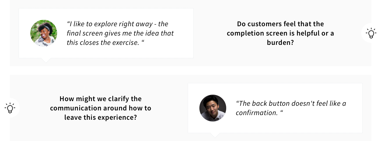
Although we didn’t have time for a full-blown usability test, we did some quick testing with internal users for a gut-check of basic usability issues that might arise. We were able to understand that the final confirmation screen was really important to closing the communication loop with customers.
Phase 4 Prototype
We optimized for ease of use and simple aesthetics that would compliment the existing visual structure in a playful and interactive way.
Visual Aesthetic Explorations
We explored what kinds of colors might be interesting, and where the notification could appear, ultimately landing on a top banner in a golden hue. It seemed to differentiate itself in the UI just enough, while not being incongruous to the screen.
Developer Communication
We mainly used Zeplin to communicate screen specs and user journeys with annotations. Some interactions were communicated via prototype, and other refinements were communicated in person collaborating side-by-side.
User Journey — Communicating the user journey to developers via touch points/tracking items.
Local Country Communication
Because this test was going live in all of our markets, we had to communicate with our local country content owners. We used a document outlining the different points of copy, hi-lighted where in the screens they were, and allowed each content owner to localize the content.
Phase 5 Test
In testings, we later introduced a “C” variant into our a/b test. This last option proved to be the solution we were looking for when it came to increasing the amount of quality customer feedback.
User Flow Adjustments
While running the test, we had several variants we ran against each other. In the end, we found that the best results across all our identified metrics was in the variant that progressively disclosed commenting information — first, a customer rates with stars, and then we ask them to give us any significant details so that our Chefs can take steps to improve the recipe.
Final Visual Design
We worked through many iterations to land on this design. While it optimizes for a mobile screen, it still has many advantages in tablet and desktop viewports as well.


