But Where Are You Really From?
An exercise in visualizing a commuting experience across multiple touch points.
User Journey Documentation
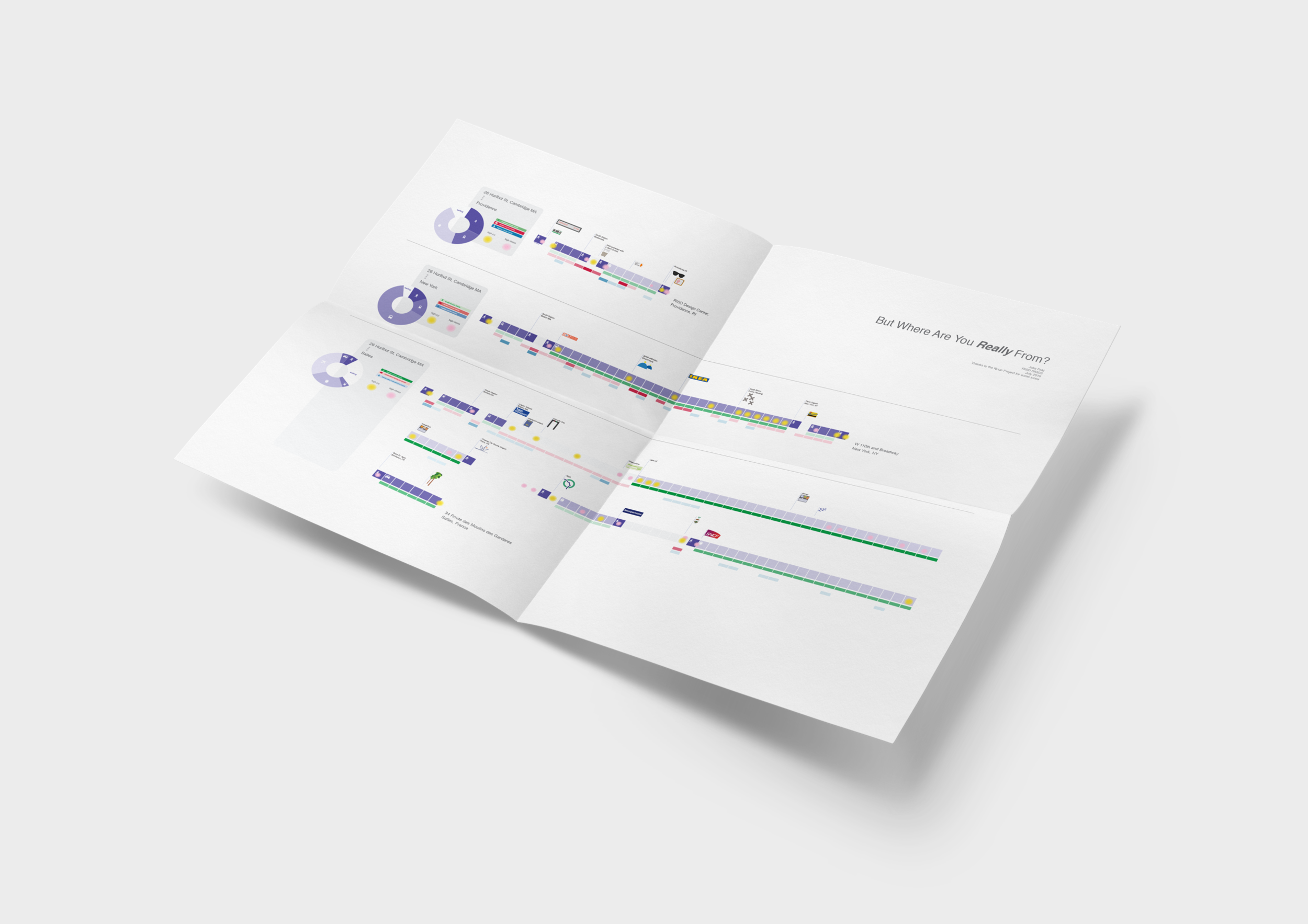
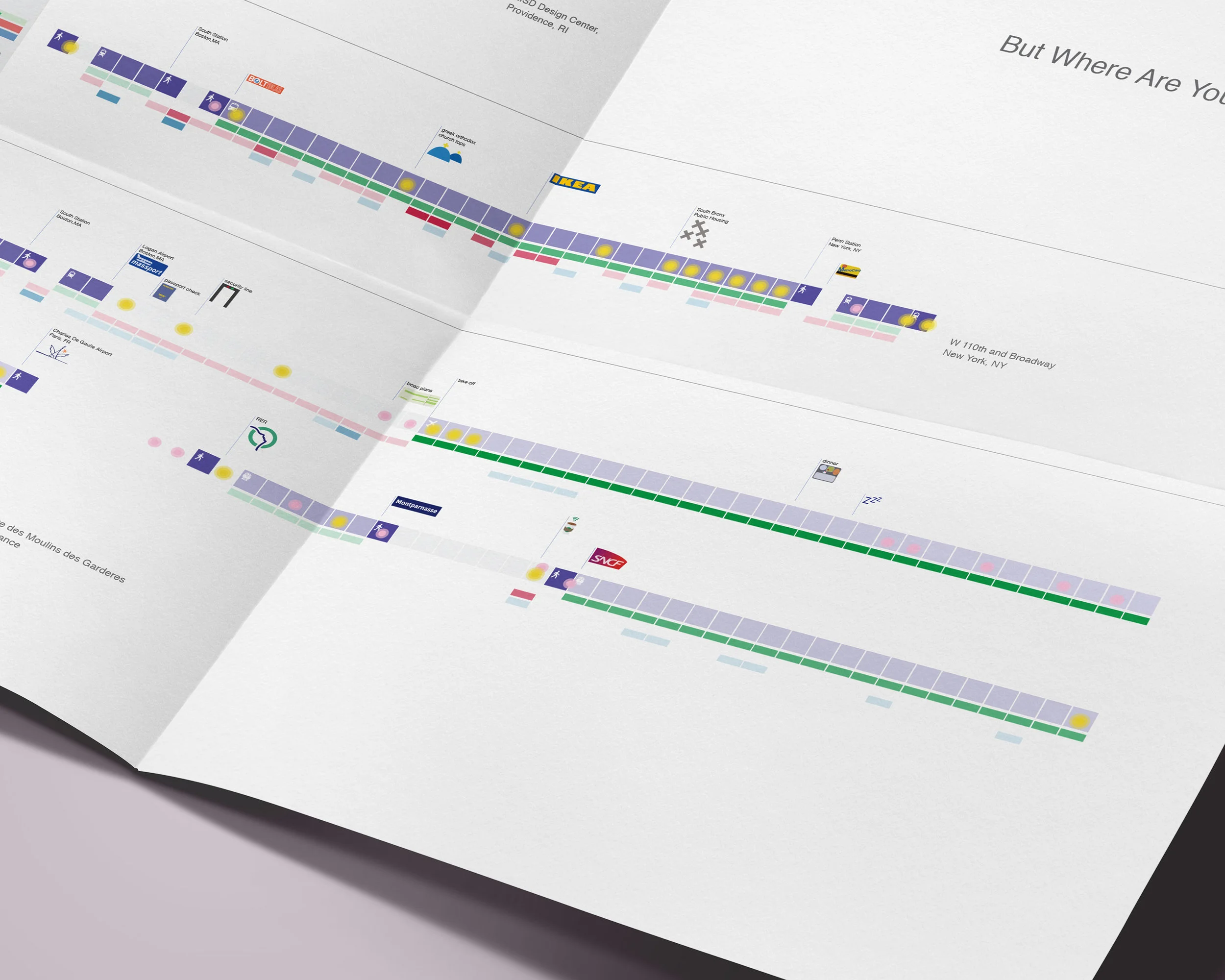
It is possible to visualize these 3 different trips in many ways. Here, I have chosen a format that primarily explores mode of transit, time, and place identifiers. Each of the 3 trips begins in the same place, and ends in a different location with increased distance. Trips vary in time, cost, landmarks, mode of transportation, text communication, water consumed, and emotional locations of high stress and/or joy.
Each purple square represents an increment of 10 minutes.
Colors
The colors were chosen to be easily differentiated.
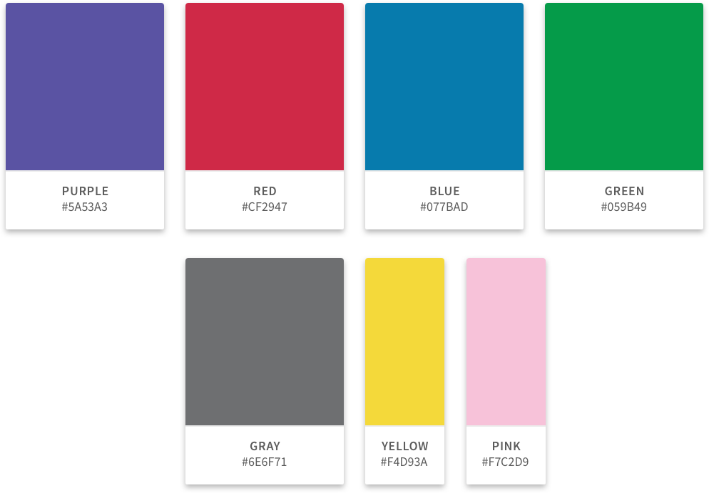
Purple (RGB 90 . 83 . 163) was chosen as the predominant color through the poster and varying shades were used to differentiate the modes of transport. The darker the color, the slower the mode of transport.
Red (RGB 207 . 31 . 71) indicates an alert on a phone, here it was used to indicate a text message alert. The darker the red, the more text messages were sent.
Blue (RGB 7 . 123 . 173) indicates water consumed. Water is traditionally visualized as blue.
Green (RGB 5 . 155 . 73) indicates cost. Money in the United States is typically visualized with green.
Gray (RGB 110 . 111 . 113) Is used for text or acents.
Yellow (RGB 224 . 217 . 58) Indicates a moment of joy through the users journey. Yellow is typically perceived as a joyful color.
Pink (RGB 247 . 194 . 217) Indicates a moment of high-stress. Red is typically used as an alert, but given that it was already implemented as a phone alert, a primary focus of data visualization, pink is a version of red that is a little more "fuzzy" like an emotion.
Typeface
Helvetica was chosen as a standard, geometric text shape to continue the geometric nature of the data visualization.


